I watch with an eagle eye how gently or how in your face the “ask” is made in emails and on websites.
During the Minnesota Public Radio annual membership drive I chuckle at the FULL SCREEN bright red donate button that pops up on their website during the entire drive. And then I happily click it to make my small annual contribution.
There are other websites, however, where I find I get an uncomfortable feeling if there is only the DONATE NOW button without any information about how or why I SHOULD make a gift. No effort has been made to engage me, share a story, or cause me to feel great about the gift I’m thinking about giving.
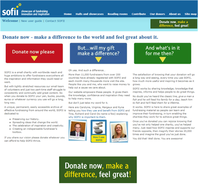
And then, recently I read about SOFII’s (Showcase of Fundraising Innovation & Inspiration) cool new 3-part website donate buttons.
Check these out. These buttons are created with the donor in mind and serve as a way to engage website visitors. I love them! SOFII explained the new buttons in an email that said:
“The idea is to offer a donate button that works with the donor’s own need and reward cycle. A donor gives and immediately gets in return reassurance that he or she has made a real difference. On top, the donor sees that there’s something in giving for them too, that in return for their gift they also gain.”
There’s a mini-conversation going on here:
And so, I hereby give you and your webmaster permission to be creative AND engaging on your website. Take a lesson from SOFII and have some fun with the donate buttons!